Hello!
I’m Andy Anzollitto, and I am a multi-disciplinary brand designer. While the outputs of my design practice span a wide range, my work begins with a focus on typography, context-specific design, and a research driven process. A constant through-line in my work is a curiosity about how type can tell stories through form and context.
For the past seven years I have worked closely with Louise Fili as her Senior Designer at Louise Fili Ltd, and now as a partner at our type foundry, Tipofili. During that time I developed an expertise in lettering, book design, brand identity and strategy, packaging, ux design, and type design. Now with over 12 years of professional experience, I maintain my own independent design practice here in Huntsville, Alabama developing brand systems and designing typefaces.
¶ If you would like to read more about my work experience, you can find more information on my curriculum vitae. The following is my portfolio organized by areas of concentration: identity design, lettering, and typeface design.


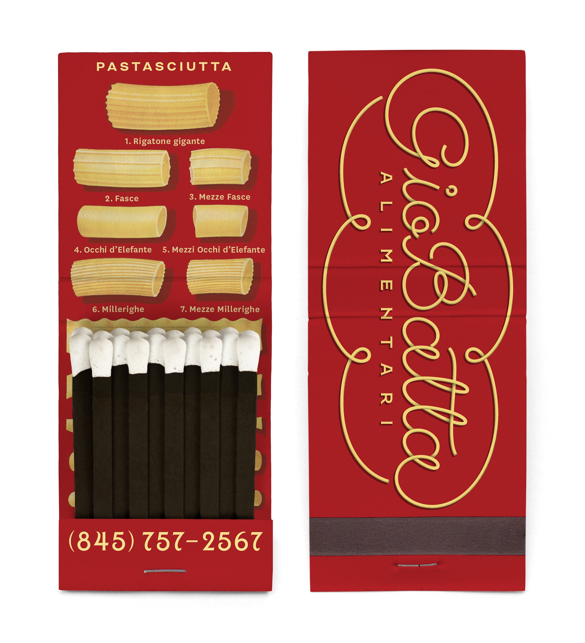


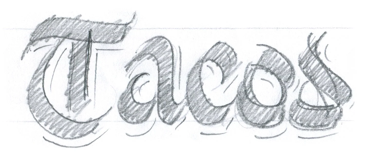
Lettering has been a constant part of my design practice and what led me into type design. Often it is part of a larger design, but who can resist a beautiful sketch all on its own?


Montecatini Pro, 2019
Montecatini Pro takes its cues from the elegant Stile Liberty travel posters of Italy in the early 1900s. Typical of the Art Nouveau movement, Montecatini’s distinctive ligatures provide flair while its widths and weight allow for dynamic copyfitting. In 2019 I was tasked with taking the initial release and translating it into a larger designspace. Ultimately three more masters were added to create 4 different widths each with 6 weights. Montecatini Pro is available for licensing through Tipofili.
🔗 see more on tipofili.com
🔗 mini-site from its 2019 release

TXC Pearl, 2021
TXC Pearl is an uppercase condensed sans influenced by both American wood type and Jugendstil lettering found in German newspaper advertisements published in Texas during the 19th century. It was released in 2021 with Cooperativa Anonima Servizi Tipografici and is available for licensing through their CAST Studies program.
TXC is shorthand for ‘Texanische’, a typographic study of the Texas Hill Country. While Texas is often presented as having a singular, monomythic history, the places and people within its confines tell stories of complexity and plurality. With this study I am using type as an investigative tool to explore a place and social history. Letterforms can operate as vessels, carrying meaning and prior associations for a reader or group. From this perspective, I looked to better understand what was unknown to me about my hometown.
🔗 see more on c-a-s-t.com/studies

Hyperdrive, in progress
Hyperdrive is a sanserif inspired by science-fiction movies and culture. My goal for this typeface is to produce a design that feels both related to the typography from sci-fi media and also connected to the environments, set designs, and illustrations that create those futuristic worlds. The latter informed the geometry of Hyperdrive which takes its cues from architectural forms in series like Neon Genesis Evangelion and Blade Runner.
🔗 see the most recent proof

Adobe Creative Suite
Motion & Video
UX/UI
Typeface Design
Coding
Misc
Illustrator, InDesign, Photoshop
Premiere Pro, After Effects
Figma
Glyphs, Drawbot
Python, html/css
Lightroom, Notion, Fusion360, ChatGPT, Adobe AI tools