Hello!
I’m Andy Anzollitto, and I am a typo-graphic designer. While the outputs of my design practice span a wide range, my work begins with a focus on typography, context-specific design, and a research driven process. A constant through-line in my work is a curiosity about how type can tell stories through form and context.
For the past six years I worked closely with Louise Fili as her senior designer at Louise Fili Ltd and now as a partner at our type foundry, Tipofili. Having worked on smaller teams, my responsibilities often extended beyond just design-work and into art direction, account management, and operations. And while I am comfortable working independently within a team, I most enjoy working collaboratively as a member of one.
¶ If you would like to read more about my work experience, you can find more information on my résumé. The following is my portfolio organized by areas of concentration: typeface design, lettering, and identity.

me at the Rob Roy Kelly wood type collection at the University of Texas.


Montecatini Pro, 2019
Montecatini Pro takes its cues from the elegant Stile Liberty travel posters of Italy in the early 1900s. Typical of the Art Nouveau movement, Montecatini’s distinctive ligatures provide flair while its widths and weight allow for dynamic copyfitting. In 2019 I was tasked with taking the initial release and translating it into a larger designspace. Ultimately three more masters were added to create 4 different widths each with 6 weights. Montecatini Pro is available for licensing through Tipofili.
🔗 see more on tipofili.com
🔗 mini-site from its 2019 release

TXC Pearl, 2021
TXC Pearl is an uppercase condensed sans influenced by both American wood type and Jugendstil lettering found in German newspaper advertisements published in Texas during the 19th century. It was released in 2021 with Cooperativa Anonima Servizi Tipografici and is available for licensing through their CAST Studies program.
TXC is shorthand for ‘Texanische’, a typographic study of the Texas Hill Country. While Texas is often presented as having a singular, monomythic history, the places and people within its confines tell stories of complexity and plurality. With this study I am using type as an investigative tool to explore a place and social history. Letterforms can operate as vessels, carrying meaning and prior associations for a reader or group. From this perspective, I looked to better understand what was unknown to me about my hometown.
🔗 see more on c-a-s-t.com/studies

Hyperdrive, in progress
Hyperdrive is a sanserif inspired by science-fiction movies and culture. My goal for this typeface is to produce a design that feels both related to the typography from sci-fi media and also connected to the environments, set designs, and illustrations that create those futuristic worlds. The latter informed the geometry of Hyperdrive which takes its cues from architectural forms in series like Neon Genesis Evangelion and Blade Runner.
🔗 see the most recent proof

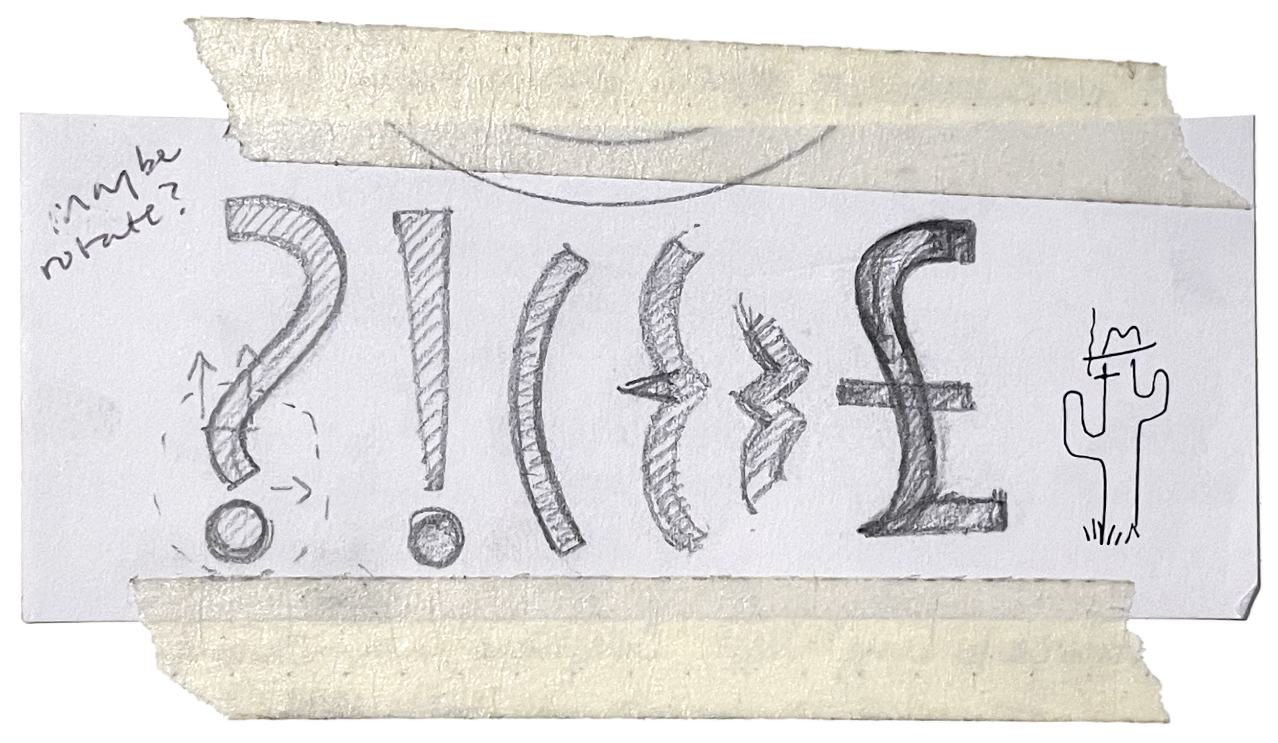
TXC Opuntia, in progress
TXC Opuntia is the second installment in the Texanische series. Like its namesake the prickly pear cactus (Opuntia Engelmannii), this spiky blackletter had been spotted across the Texas Hill Country during the 19th century. In specific, TXC Opuntia is a revival of Schwabacher No. 2 by American Type Founders (via Central Type Foundry).
I had initially set out to make a faithful revival after finding Schwabacher No. 2 in metal type during a visit to the Sophienburg Archives. However there were irregularities—dissonant construction methods, an uneven-ness that disrupted the texture of the text—and I made the choice to re-interpret some of the character set while staying as close to the source as possible. This was done by further researching the schwabacher style and gleaning alternate glyph constructions when suitable.
🔗 see more on tipofili.com
🔗 see the most recent proof

Marseille, 2018
Marseille is an Art Deco-inspired typeface based on Louise Fili’s iconic cover design for The Lover. Initially released as a single style, I was brought onto the project with the task of expanding the font into a range of weights. While revisiting the design, we decided to add more OpenType features that addressed some of the feedback on the initial release—notably ss05 (alternate “more normal” S), ss03 (lowered crossbar on e), and ss07 (closed e). Marseille is available for licensing through Tipofili.

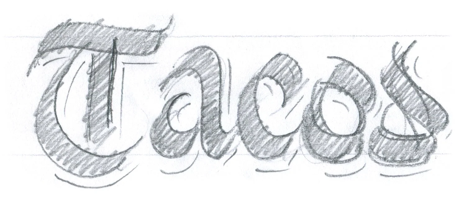
Lettering has been a constant part of my design practice and what led me into type design. Often it is part of a larger design, but who can resist a beautiful sketch all on its own?


Beyond my role as a designer, over the past decade I have contributed to the operations and business development of the design studios where I have worked.
Before moving to New York in 2017 I helped run two branding studios—one based in Texas and the other based in Los Angeles. During that time I worked directly with clients from defining scope of work, to strategy meetings and presentations. It was also my responsibility to work with external vendors like web developers, sign painters, and printers to ensure designs were made to specification and fit for use in environment.
Many of these responsibilities continued during my time at Louise Fili Ltd. Then in the spring of 2020 during lockdown, I was tasked with re-organizing our studio workflow to be remote capable. Together with my studio-mate Matthew Smith, we migrated our entire studio archive onto a cloud platform (over thirty years worth of work and data across multiple storage types, some analog).
In that same year I—alongside Matt and Louise—began building what would become our type foundry, Tipofili. What started as an ambition to create a home for the fonts we were making quickly morphed into discussions about incorporating a business, meetings with lawyers about license agreements, and solving how to make our remote operations feel as collaborative as when we all sat around the conference table in our 23rd street studio. The latter involved assembling a lattice-work of tools that organized our work, conversations, and weekly meetings. Over time we also developed methods to make whiteboard sessions and font reviews more collaborative in real time. Now three years later, I’ve found this operational work to be invaluable when we meet to discuss things like updates to our website, social media posts, and new ways to promote our fonts.
While I did not set out to be a business-person when I got my art degree in college, I have found a lot of satisfaction and appreciation in learning the business of running a design studio, and the work of improving those operations has been a creative act all its own.

Typeface design
Adobe Creative Suite
Motion & Video
UX/UI
Coding
Misc
Glyphs, Robofont, Drawbot
Illustrator, InDesign, Photoshop
Premiere Pro, After Effects
Figma
Python, html/css
Notion, Typeface App, Fusion360